
DBC: Site Design > Homepage Template
Welcome to the Homepage Template! With this powerful tool, you can create functional homepages in no time. Choose from a selection of suggested templates, so you don't have to start from scratch. Thanks to intuitive drag-and-drop elements, admins —regardless of design experience—can easily build pages with no coding required. Add quick links to DB Commerce catalogs or specific items for seamless navigation, and enjoy the flexibility of creating custom group homepages tailored to different needs. It’s never been easier to design a homepage that’s uniquely yours!
HOMEPAGES
Homepage Template is located within New Distributor Admin, Site Design. Once selected you will be presented with 5 homepage templates to select from. Four predesigned templates that will allow you to change images, add text, modify the layout and add additional content, and one blank template where you can begin with your own design. By default, when selecting Homepage Template you will be working within the Company Homepage. The Company Homepage is displayed to all user groups. (See group specific homepages below.)
NOTE: All responsive sites are defaulted to Template A, until redesigned or overridden.
Clicking the “Preview” button will allow you to see a full screen view of the template.
Clicking the “Configure” button will allow you to begin customizing the homepage template.
Once a template is activated, you will be allowed to "Copy" that template to a group.

Once you “Configure” you have the following options:
- Reset – Will clear any changes and restore the master homepage template
- Desktop Preview – Will allow a preview of the homepage template in the legacy interface. You will be asked to log into the site to view. Don't forget, you must save to see the preview.
- Mobile Preview - Will allow a preview of the homepage template in the responsive interface. You will be asked to log into the site to view. Don't forget, you must save to see the preview.
- Save – Will save any changes you have made to the homepage template.

QUICK LINKS
Catalog Quick Links – This dropdown will show all available catalogs within in your DB Commerce site. Supported catalog types are Default Catalog Style, Carousel Catalog, Order Form Catalog and Asset Catalog.
- Catalog URL – Is the path to the catalog, you will use this to link an image or text to a specific catalog.
- Image URL – Is the path to your catalog thumbnail image, you will use this if you want to pull your catalog thumbnail image into your homepage template.
- Catalog Name – Is the name of your catalog, you can copy and paste if you wish to use it within your homepage template.
- Catalog Special Instructions – Is the catalog description, that you can copy and paste if you wish to use it within your homepage template, if one is not present it will not show.
-
Full Path – If the catalog is a sub-catalog, the catalog structure will show.
Item Quick Links – This dropdown will show all the available items within your DB Commerce site. Supported Item types are Inventory, Print on Demand, Chili, Promo, Promo Personalization, Email, and Assets.
- Item URL – Is the path to the item, you will use this to link an image or text to a specific item.
- Image URL – Is the path to your uploaded item image, you will use this if you want to pull your item image into your homepage template.
- Item Code – Is your item code, that you can copy and paste if you wish to use it within your homepage template.
- Item Name – Is the name of your item, that you can copy and paste if you wish to use it within your homepage template.
- Item Description – Is the item description, that you can copy and paste if you wish to use it within your homepage template, if one is not present it will not show.
HOMEPAGE TEMPALTE EDITOR
Content
There are many content blocks you can use while designing in the Homepage Template. All content blocks include padding settings and hide-on settings in the sidebar.

Below we've listed all the available content blocks. Read below to learn more about the associated type of content block.
- Title
- Paragraph
- List
- Image
- Button
- Table
- Divider
- Spacer
- Social
- HTML
- Video
- Icons
- Title - This content block allows you to set a hierarchy within your design using header tags. The Title content block allows you to set the H1/H2/H3 tag without custom HTML. This enables you to order your design for compliance with web accessibility standards. The title content block works much like the paragraph content block. When you drag a title block to the builder stage, you'll see a familiar toolbar.

- Paragraph - This content block allows you to set specifics for your fonts, such as family, weight, size, color and alignment.

When you drag a paragraph block to the builder stage, you'll see a familiar toolbar.

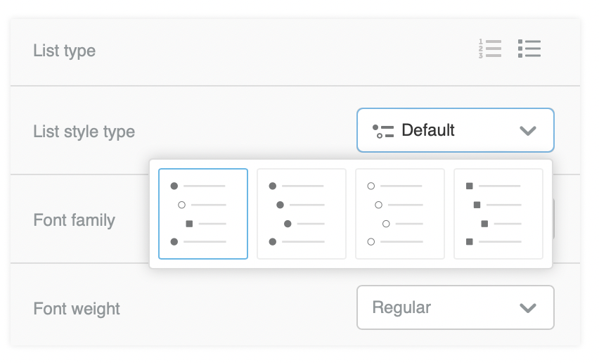
- List - This content block includes all the new features seen in the paragraph content block. However, you'll find some content properties specific to list content. The options specific to the list content block are as follows:
- List type, which allows you to choose an ordered or unordered list.
-
List style type, which enables you to select some basic styling options for your list.

- Start list from, which is a conditional option that populates when you choose an ordered list. Use this if you're creating an ordered list across multiple content blocks.
- List items spacing, which allows granular control over the spacing between list items.
- List items indent, which allows granular control over the indent on list subitems.
-
Image - This content block allows you to add images to your design. When you drag an Image into the builder stage, you will see an option to "Browse." In the right Content area, there is also an option named "Choose Image" or "Change Image" if an image is already selected, that will take you to the same image menu.


Remember the quicklinks above? If you copy the Catalog or Item Image URL, and paste it into the URL (below Apply effects and Change image), your DB Commerce image will appear within the homepage. This is a direct link to what has been uploaded to your DB Commerce catalog thumbnail image or item image without having to upload that image again within the tool.

Once you select your image the image editor that allows you to crop easily, rotate, resize, apply filters/frames, add stickers... and much more - to any image without leaving the builder. When you select an image in the builder, you'll see an "Apply effects" button. Click on it to access a tool that allows you to edit the image in various ways. If you click "Apply effects" you will see the toolbar below. Click each area to see what they can do!

One of the most important areas within images will be the Action section. Remember the quicklinks from above? If you copy the Catalog or Item URL into URL, once the user clicks on the image, they will be taken to that catalog or image.

-
Button - With button styles, you can drag and drop a button that matches your brand at any time. By default, your button will populate with default colors. This changes in real-time as you make adjustments to the button values. You can add a URL so when the user clicks the button it's linked to something, change fonts, colors, and alignments all within the Content Button Properties.

Table - The table content block includes the option to add headers to the first row of the table. These headers behave as column titles and enable you to associate each column with a category. You can choose to make your table with or without a header row. If you initially create the table with a header, delete it, and then decide to add it back later, any formatting or styles from the original header will be lost. You'll have to start designing the header row from scratch again.

You’ll have the following options for customizing the structure of your table content block:
- Columns: Add or remove columns to the right of your table. The maximum number of columns you can add is eight.
- Rows: Add or remove rows to the bottom of the table. There is no maximum number of rows you can add to the bottom of your table.
- Background color: Edit your table’s background color.
-
Border: Customize your border style. You have the option to choose from solid, dotted, and dashed. You can also select a custom border color and size.


-
Divider - The divider content block traditionally uses a physical divider line that you can drag and drop into your design. If you have a visible divider, you can customize the look and feel using the Line settings in the sidebar. These settings include line appearance (solid, dotted, or dashed), line height, and a color picker.
You also have access to a Width setting, which determines how much of the column containing the line will fill. You can also Align your divider to the left, center, or right.
The divider content block also includes padding options. Divider padding works the same as it does for most other content blocks.

-
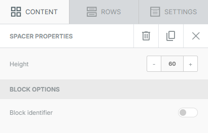
Spacer - The spacer content block acts much like a transparent divider in that it simply creates blank space in your design. As a result, the only setting that the spacer has in the sidebar is Height, which allows you more granular control over the empty space you are creating.


-
Social - The social content block allows designers to easily link their social media profiles to designs. It can also be used to add social share buttons to a design. It includes several collections to choose from and the option to add custom icons.
By default, the Social content block shows icons for the following social media platforms:
- X

Use the Select icon collection dropdown menu to browse and select an available icon collection. Each icon includes a Url field and a Delete option. To change the order of the icons, click and drag using four horizontal lines in the upper left-hand corner of the icon options.
For additional options, toggle on More options for any social icon. This expands the options to define a Title and Alt text. Titles appear when a recipient hovers over the icon, whereas the alt text displays if the image fails to load.
The Social block in the Page builder also includes a Target dropdown field. Use this to determine whether the link will open in the current or a new page.
To add more social media icons, scroll down in the sidebar and click the button to Add new icon. You will find a list of options that match your selected icon collection. If you can't find the platform that you're looking for, there is also an option to Add custom icon.
-
HTML - The Custom HTML content block allows you to easily add your own HTML code to a design. It’s as simple to use as a text block.
HTML experts only: Using your own code may affect how the design is rendered. This could prevent it from adjusting to the screen size (i.e. the "responsiveness" of the design). Make sure to use HTML that is email-compliant and responsive. Keep in mind that custom HTML is outside of our scope of support.
- Video - When working with a video content block, the builder sidebar includes a dropdown menu. This menu allows you to select what type of video you are inserting.
- Video URL:
- Thumbnail: With this method, you can use public YouTube and Vimeo videos. We'll pull a thumbnail from the video hosting service and overlay a play button on it. The video does not play on the page. Instead, the visitor is redirected to the YouTube or Vimeo page where the video is hosted
-
Embedded: As the name implies, this option allows you to embed videos (such as those on YouTube or Vimeo) on the page. This method also allows you to use videos in all privacy settings except Private.
This option generates a Controls toggle and a Loop toggle. The controls option allows you to control the video progress bar. The loop option allows you to create loop playback.
- Video URL:


-
Icons - The icons content block allows you to use small images and text together in a single content block to provide more flexibility in your designs. In order to get started, drag an icon content block into a row. A filler image will fill the content block; click on this to open the icon options in the sidebar. Click on Add new icon to get started. A pre-loaded icon will populate on the builder stage.

You can use the pre-loaded icon, or you can change the image by using the Change image button. This will open the file manager. You also have access to the image editor, if you use the Apply effects & more button. If you use the toggle to open More options, you'll find a couple of options specific to icon content blocks.

Rows
Rows are the primary structural element for designs created in the Homepage Template. Within your rows, you can customize the column structure. With a multi-column row, you can place content side-by-side in your design. Most importantly, rows act as a container for all of your content blocks.

The following options populate in the sidebar when working with rows:
- Row background color
- Content area background color
- Content area rounded corners
- Content area border
- Do not stack on mobile
- Reverse stack order on mobile
- Row background image
- Row background video (Pages only)
- Hide on
As mentioned above, rows can include columns as well. As a result, there is a second section called Customize columns. You can use this section to modify the column structure. There is an +Add new button you can use to insert new columns. A separator icon populates between each column. Click and drag the icon to change the column structure.
For each individual column, you have the following options:
- Column background color
- Padding
- Border
To toggle between columns, click on the column in the sidebar you want to modify. The selected column is highlighted in purple.
Settings
The settings tab allows you to set defaults for your entire design. When working with rows and content, those design elements inherit these settings.

You can use the settings tab to modify the following options:
- Content area width
- Content area alignment
- Background color
- Content area background color
- Background image
- Default font
- Link color
GROUP HOMEPAGE
Group Homepages can be used if there is something different you want to display to the Group rather than the Company as whole. Next to the header "Homepage Template List", there is a Company Tab and Group Tab. Selecting the Group Tab will allow you to set up a unique Homepage at the Group Level. Once the admin clicks the Group Tab, they will be presented with a dropdown of groups to select from and configure a homepage for that group. Follow the process outlined above in the Company Level section.

An Assignments button has been added for quick view of which groups have group specific homepages. The Template Column displays which template is being used for a group.

Group Homepages will have an Inactive button, that will allow them to remove the Group Homepage and default to the Company Homepage if desired.
